
How good are you at spotting patterns?
The perils of mistaking randomness for meaning

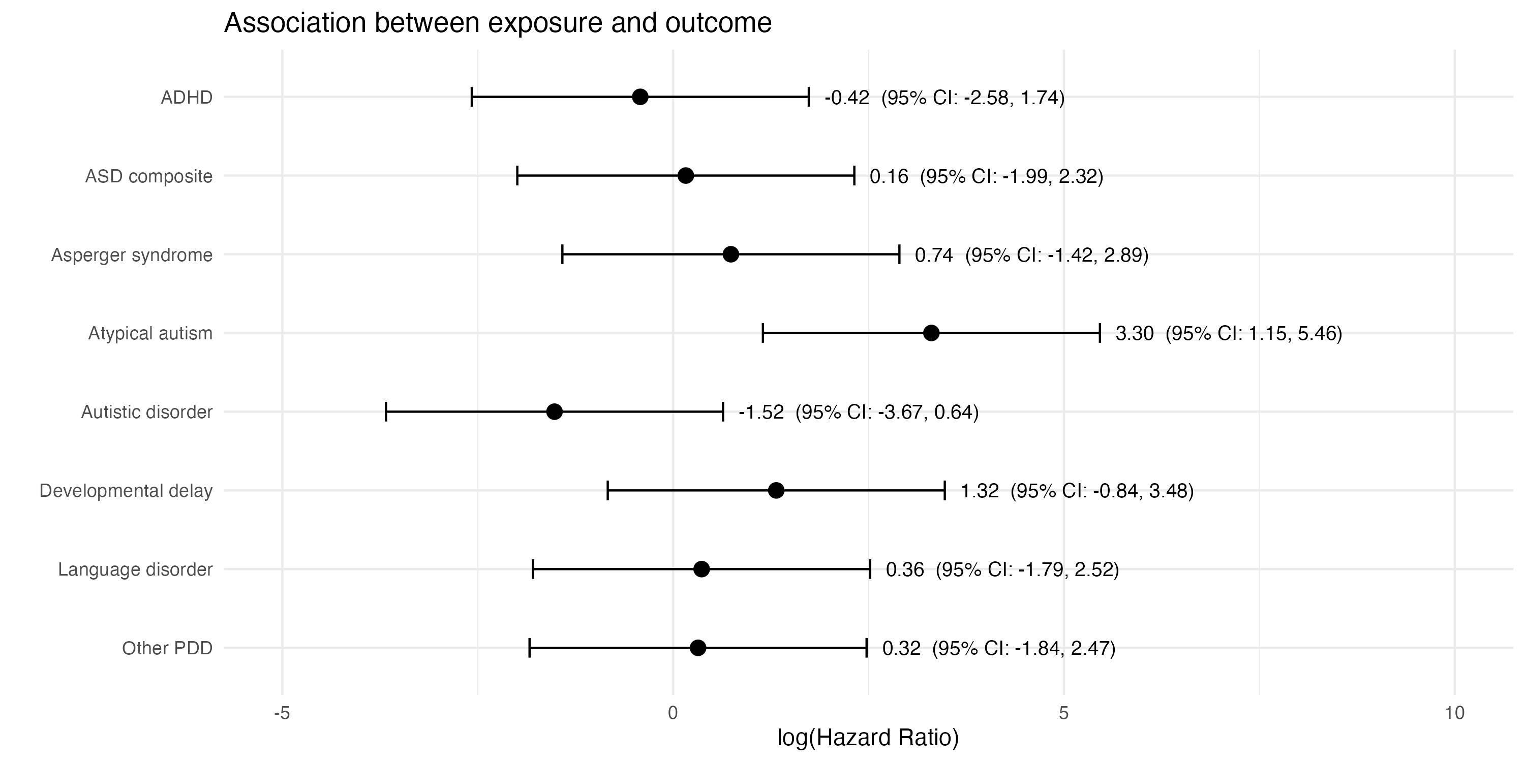
How good are you at spotting patterns? Take the below plot, which shows estimates of how much exposure to a particular chemical is associated with different neurodevelopmental conditions among young children.
Notice anything unusual?
One estimate probably stands out: the hazard ratio of 3.30 (95% CI: 1.15–5.46) for atypical autism. This would appear to show that exposure to the chemical is linked to a significantly higher hazard of having this condition.
But is it really?
What if I were to tell you that the above plot doesn’t contain real estimates based on real data. Instead, it’s fictional: I simulated 400 random mean values from a normal distribution1. Then I picked a group of eight that included the randomly generated estimate with the largest positive value (i.e. 3.30).
‘Hang on a minute!’ you might be thinking. ‘You can’t just search through 400 random values and pick the outlier, then focus on this one as if it’s meaningful.’
And you’d be right. You might even elaborate: ‘You should have told me that you’d looked at 400 different numbers, and then you should have accounted for the fact that this many arbitrary comparisons will generally throw up a lot of false positives that are really just random noise.’
And, again, you’d be right. Because that 3.30 estimate was literally just cherry-picked random noise in this case.
Which brings us to the new CDC website on autism and vaccines and its claim that ‘Studies supporting a link have been ignored by health authorities’. For example, it states that:
Evidence from a large Danish cohort study reported no increased risk for neurodevelopmental disorders with early childhood exposure to aluminum-adsorbed vaccines, but a detailed review of the supplementary tables shows some higher event rates of neurodevelopmental conditions with moderate aluminum exposure (Supplement Figure 11 — though a dose response was not evident) and a statistically significant 67% increased risk of Asperger’s syndrome per 1 mg increase in aluminum exposure among children born between 2007 and 2018 (Supplement Figure 4)
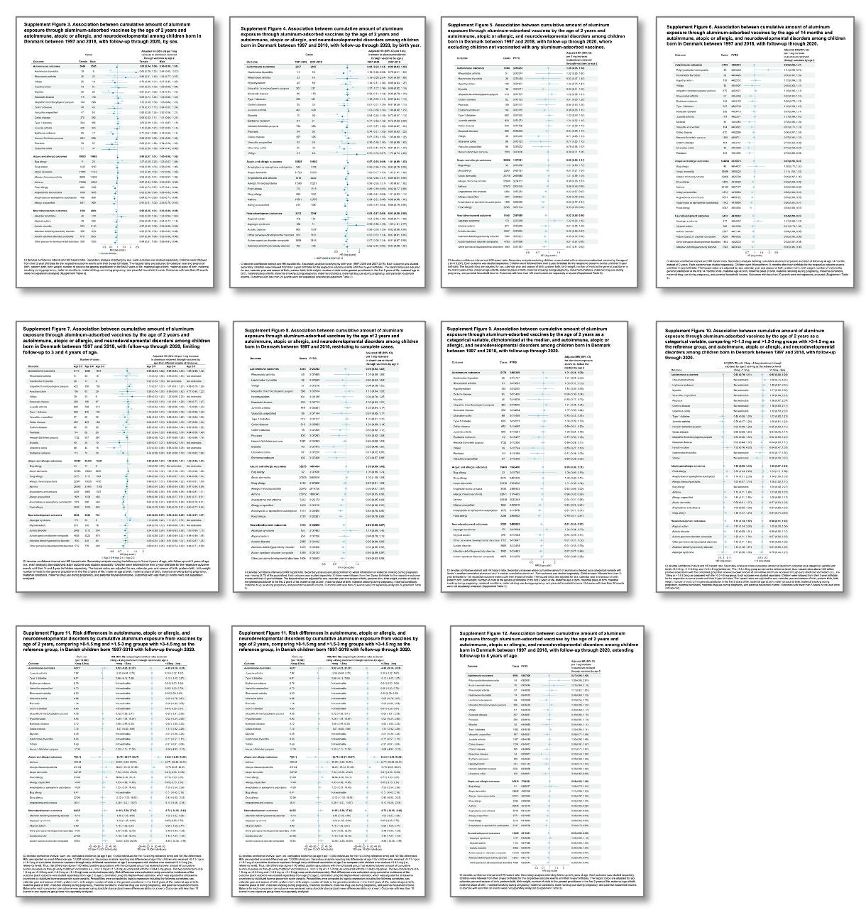
For context, here are all the supplementary tables in that Danish paper. As you can see, there are an awful lot of numbers (over 400 in total) to potentially choose from:
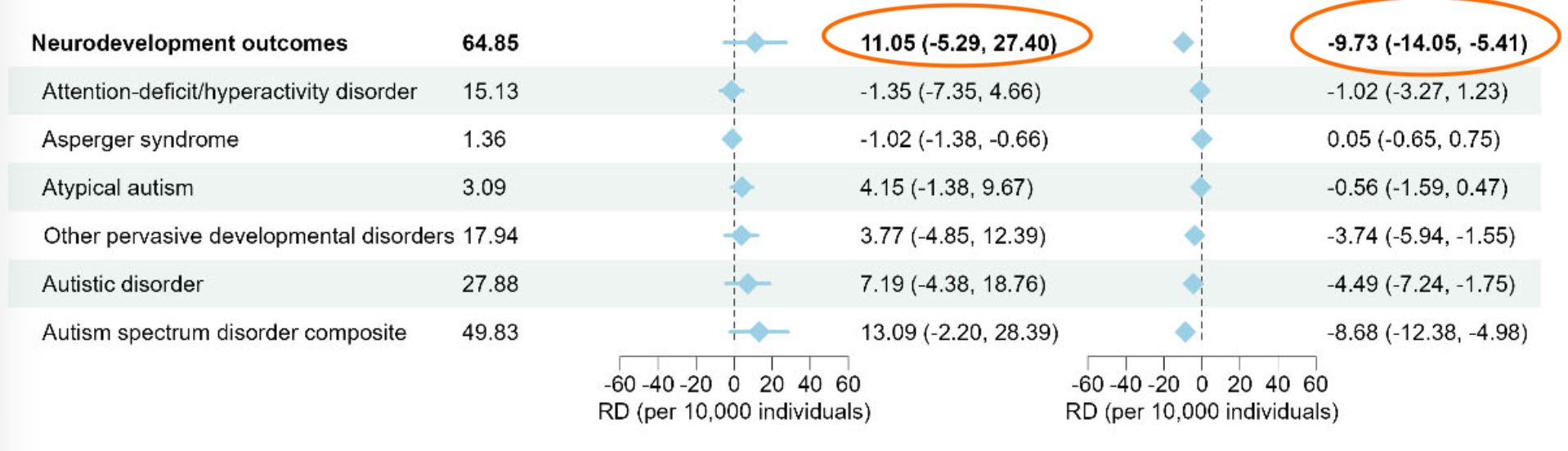
Take Figure 11, which the websites claims ‘shows some higher event rates’. The left column is larger aluminium exposure vs very low exposure. The right column is larger aluminium exposure vs low exposure. So the result we’d expect to see if there was an effect of aluminium exposure (i.e. negative for both, and more negative for left hand side) isn’t there. In fact, the overall signs are different:
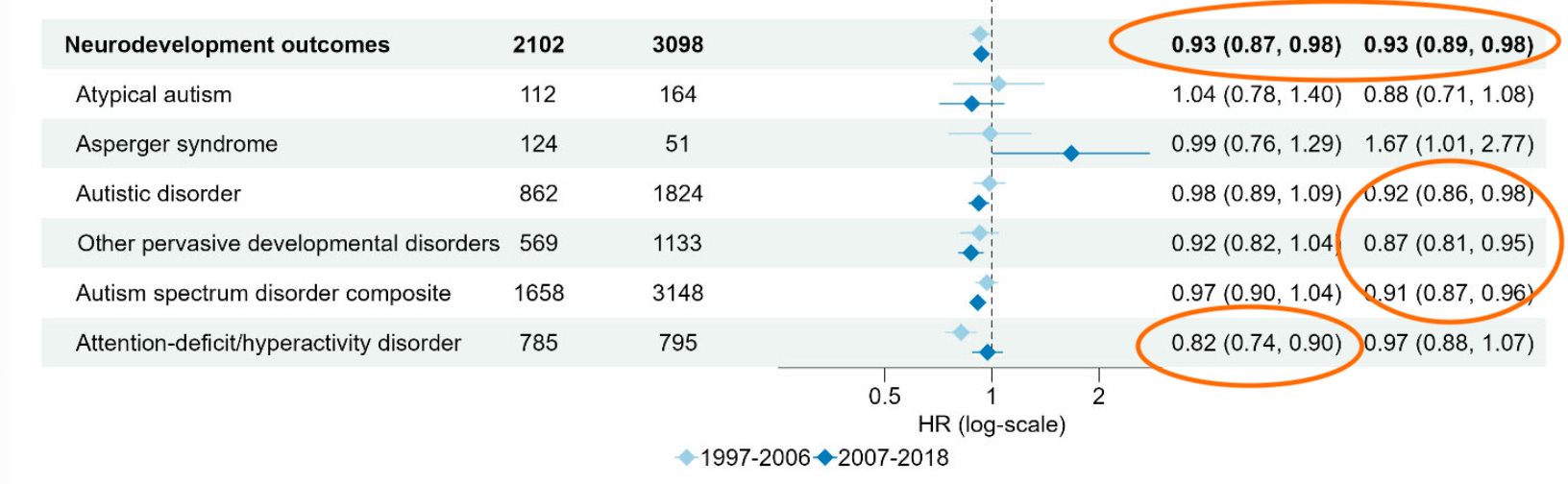
Then there’s Figure 4 with the ‘statistically significant 67% increased risk’. Specifically, the table shows an estimate of 1.67 (95% CI: 1.01–2.77), which is equivalent to a p-value of around 0.047 (i.e. only just ‘statistically significant’ if we use the traditional 0.05 cutoff). But again, remember there are over 400 values to pick from. So anyone doing this kind of analysis must adjust for the fact they’re comparing so many arbitrary things.
For example, if we use a Bonferroni correction to account for multiple comparisons, the threshold for ‘statistically significant’ with 400 comparisons isn’t 0.05. It’s 0.05/400 = 0.000125. Which means the above estimate is nowhere near meaningful given there are so many things being compared.
If we look closer, we see that most ‘significant’ effects are negative, i.e. more exposure is associated with lower risk. But again, once we adjust for the many arbitrary comparisons that have been done here, this is all very likely to be down to focusing in on a single chance event, and ignoring the 400+ others.
Regardless of our prior beliefs about a health issue, if we want to investigate a scientific hypothesis, we can’t just dredge through data until we find a number that suits us. We have to account for the fact that each additional comparison we make is an opportunity to mistake random variation for a real finding.
I simulated 400 means for each estimate from N(0,1), with all estimates having an assumed standard deviation of 1. This produced 400 simulated log(hazard ratio) values, with a value greater than 0 representing a greater risk, because log(1) = 0. Edit: an earlier version was labelled ‘hazard ratio’ rather than ‘log(hazard ratio)’ but the overall message is the same.
I've always wondered why the standard forest plots don't have a Bonferoni-like correction. In your example, why not have the figures use a 99.9875% CI? The bars would be much wider and not seem to falsely show significance.
Not sure if you did this on purpose, but it immediately jumped out at me that "atypical autism" has the largest positive odds ratio and "autistic disorder" the largest negative odds ratio. If you combined those two groups you'd probably have no effect in aggregate. If this was real data I'd be quite skeptical that this was a real effect and not just caused by some confounder. Maybe in geographic regions where the chemical is more likely to be present a diagnosis is more likely to be "atypical autism", for whatever unrelated reason, and vice versa in the regions where the chemical is less likely to be present.