Suppose we want to know how many people got infected during a historical epidemic. The problem is that even if we have a good way of measuring past infection (like antibody testing), we won’t necessarily have samples from before and after the epidemic we’re interested in, so we can’t directly calculate how many people had evidence of infection. Worse, we might not even know exactly when the epidemic occurred.
Fortunately, we can still get insights out of data collected years – or even decades – later. And the idea that makes this work is arguably one of the most elegant methods in an epidemiologist’s toolkit.
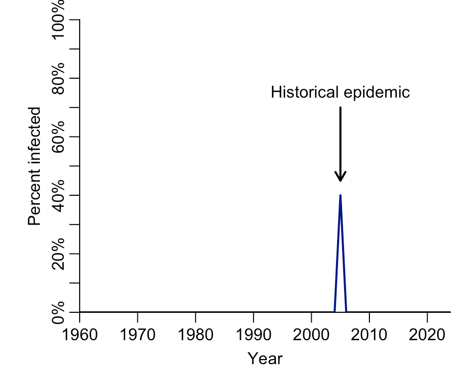
Let’s say the epidemic we’re interested in occurred in 2005, and 40% of the population got infected. However, in reality we don’t know this percentage. Hence the below plot is what we’d like to estimate:
Despite not knowing who was infected in the population, we do know who could have been infected: only people born before 2005. Anyone born later wouldn’t have been around during the epidemic. For many infections, we can use antibody tests to estimate which people have evidence of a prior infection. The pattern of antibody results by age can therefore tell us something about historical infection dynamics:
As you can see in the above plot, 40% of the people aged 19 and over (i.e. born before 2005) in this example have evidence of infection, but nobody younger does (i.e. born after 2005). In other words, we can infer that an epidemic must have happened in 2005 and infected 40% of those who were alive at the time. (Although note there is also the issue of ensuring we’re sampling enough people in a survey to estimate this year and percentage accurately, and that the antibody test we’re using is sufficiently interpretable).
A more complex history
We’ve seen how we can construct a single historical epidemic, but what about multiple ones? For example, if we test people in the modern day and see the following pattern, what does it mean?
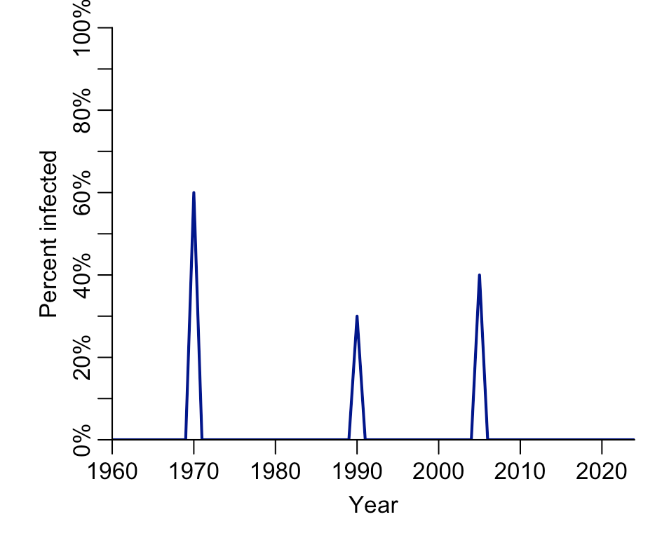
We can use the same logic as before, working through age groups. But this time we need to consider how many were left uninfected after an epidemic. Take the 19-33 age group, 40% of whom are positive, unlike those older and younger. As before, this suggests an epidemic in 2005, and another in 1990.
But how big was that 1990 epidemic? Let’s start with the observation that 58% of those in their mid-30s and 40s have evidence of infection. Because the 2005 epidemic infected 40% of the population alive at the time, that 1990 epidemic added 18% to the positivity in 33–53 age group. However, it doesn’t mean this percentage got infected, because we aren’t starting from 0%; we are starting the comparison from 40%. So we need to scale the amount by the maximum possible difference we could have measured (i.e. 60%):
In other words, our estimate for the percent infected during the 1990 epidemic would be 0.18/0.60 = 30%. We can use the same logic on the third epidemic, to reconstruct the historical epidemic sizes:
One nice application of this method is an analysis of chikungunya in Cebu, Philippines, which reconstructed epidemics from antibody levels across ages. The below shows estimates based on different assumptions about the length of outbreaks:

What’s especially remarkable is that some of these historical epidemics – like the one estimated in the late 1960s and mid 1980s – weren’t ever documented in Cebu. But other ad-hoc sources support the conclusions. In 1968, the nearby island of Negros reported chikungunya hospitalisations, and in 1986, one US Peace Corps volunteer stationed in Cebu was diagnosed with chikungunya.
These concepts can also be applied if antibodies wane over time, albeit with the need for slightly fiddlier methods. Eleanor Rees, who recently completed a PhD with Rachel Lowe and me, has used age-specific antibody data to investigate the dynamics of leptospirosis and seasonal coronaviruses.
Beyond epidemics
It’s not just infections where we might be interested in the chance of something happening in a given time period. Take children’s speech (more in this previous post of mine). We’d expect the percent of children who can say a given word to increase over time. But when is it mostly likely they’ll start to say it? And what if they haven’t said a word yet? What’s the probability they’ll say it in soon?
For example, here are estimates of the percentage of children who can say the word ‘balloon’ by age in months:
If we look at the slope of the above curve, we can estimate when children are most likely to start saying ‘balloon’. Based on the WordBank data, the peak seems to be at around 18-20 months:
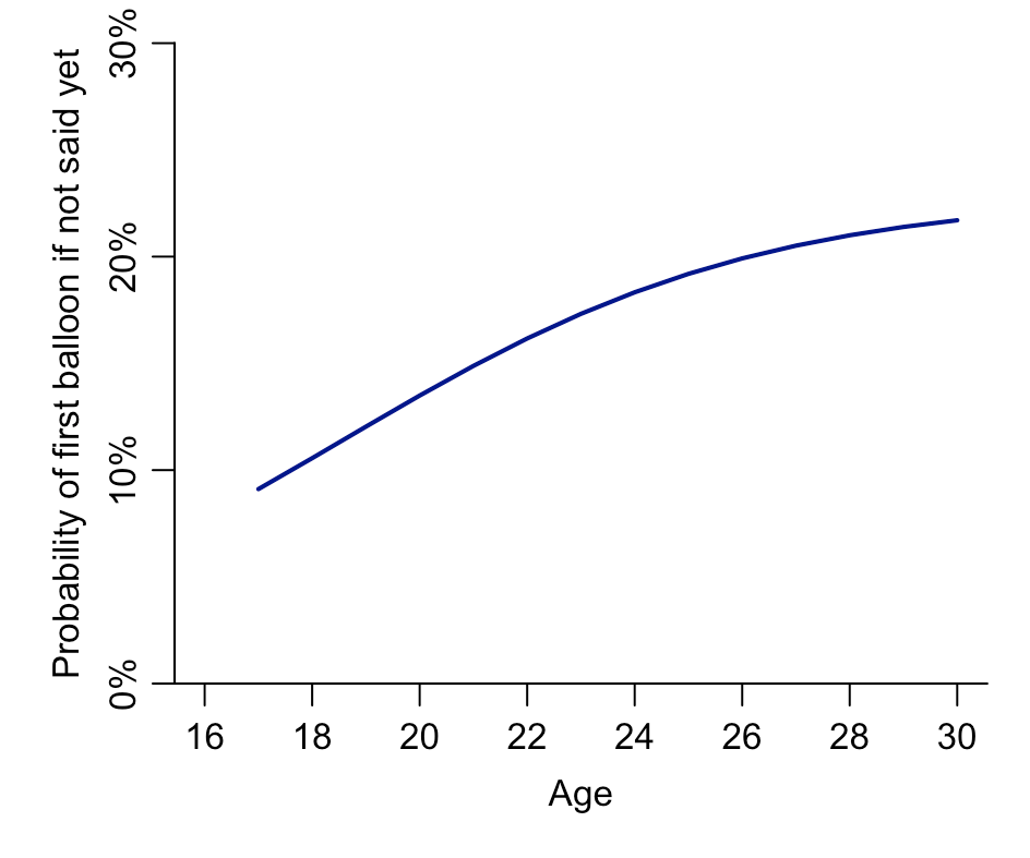
But what about a child that hasn’t said ‘balloon’ yet? If we use the logic from the previous section, we can calculate the relative increase during each month, which gives us the probability a child will first say ‘balloon’ at a particular age in months, given they hadn’t yet said it as of the previous month:
So although the absolute increase in percentage of children saying balloon for the first time gets quite small by 2+ years, the above plot shows that the relative increase among those who haven’t said it yet continues to grow by age. In other words, the longer a child goes without having said ‘balloon’ yet, the more likely it gets they’ll say it next month.
Remember how I said these ideas are one of the most elegant methods in an epidemiologists’ toolkit? Ultimately, I think their appeal comes from their ability to extract information that might not be immediately obvious from the raw data. The notion that we could estimate historical patterns over time from static modern data seems incredible, and people often take some persuading when I tell them about the possibility.
But hopefully the above has done enough to convince you that it is possible. And that, by thinking a bit more about age patterns in certain datasets, there’s a lot we can potentially learn about history.


